


In this project, Hugo Hodge creatively produced a whole branding package for an imaginary company, starting with the logotype. The stylization of the pizza was inspired by artists like Jack Kirby and Gino Severini.
Mach Pizza Logotype
The second stage in our branding package was the menu, formatted and lettered to call back to Futurist poetry and Russian constructivism with mathematical symbols and curved text on borders-turned lines.
Mach Pizza Menu
First part of the business system. Starts with a 2 x 2-inch logo and 1 1/2 x 2 text measurements, with a thumbmark on the back.
Mach Pizza Business system - Card
The business system’s envelopes. It has pepperoni dot elements from the previous logo to make texture for the remaining envelope cover, while the pizza symbol has yellow “negative space” to drive attention to the envelopes’ seal flap.
Mach Pizza Business system- Envelope
Mach Pizza’s last piece of the branding project is the Brand Guide, where you clarify the visual rules of your brand, the “vibe” or company mission those rules came from, and the real life collateral of the brand.
Mach Pizza Brand Guide

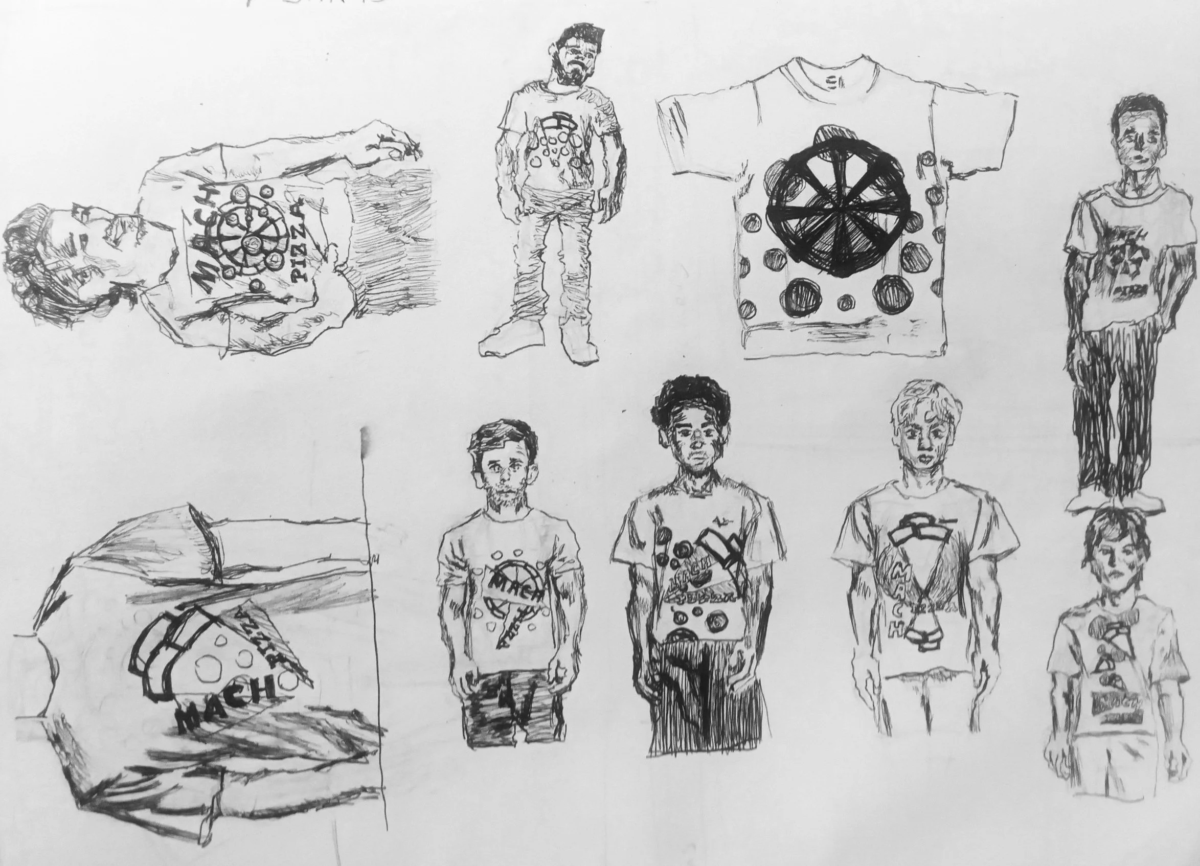
When developing Mach Pizza’s branding, a big thing in figuring out design ideas is sketching them out so you can iterate on the design and how they look on collateral.


Mach Pizza Sketches


